Design System
Role:
Lead UX & Visual Designer
Team:
Designer (me), Web Developer, Engineering Manager
Timeline:
Jun 2025 - Present
Tools:
Figma
Client:
The Pinnacle Kigali
In 2025, while partnering with a client in Kigali, Rwanda, to design the debut website for their boutique hotel, I noticed a recurring challenge: growing pains from a lack of structured design processes. The result? Rushed turnarounds that threatened the brand’s visual consistency and scalability.
As the workload grew, I saw an opportunity to build a design system, one that could bring structure, strengthen collaboration, and scale alongside the brand’s ambitions.
The Challenge
Tasks piled up, last-minute changes became routine, and Design QA turned into an endless list of mismatches. I was working late almost every day, even on weekends. That was my first couple of months working as a freelance designer for a luxurious boutique hotel based in Kigali, Rwanda.
It was also my first time in the hospitality industry, and I was genuinely excited. The work was full of unique, interesting challenges. But I soon realized the biggest hurdle wasn’t the design work. It was the process. Our newly formed team was still figuring out how to collaborate, and the lack of structure was slowing everything down.
As the scope kept expanding and new requests rolled in, it became clear that without a shared system, it was going to be incredibly difficult to maintain consistency across all our outputs, let alone scale.
That’s when I decided to build a design system.
Was this strategy the right call to tame the chaos? We are about to find out.
The Goal
Initial motivation
Although the entire team would eventually benefit, the first version of the design system was built for me. After weeks of reacting to last-minute requests and digging through scattered assets, I needed a faster, more structured way to respond to design tasks, without compromising quality.
Next goal
Once the foundation was in place, my next goal was to align the system with the developer's setup. If we could speak the same visual language, using shared tokens, naming conventions, and logic, we could reduce back-and-forth and move more efficiently.

Long-term vision
In the bigger picture, I wanted to advocate for using the system across all projects. Not just as a file in Figma, but as a shared source of truth that supports all design work, from the hotel’s website to future expansions like the mobile app. The goal is to create a unified foundation that brings speed, consistency, and clarity to every customer experience.
The Process
Audit key design assets
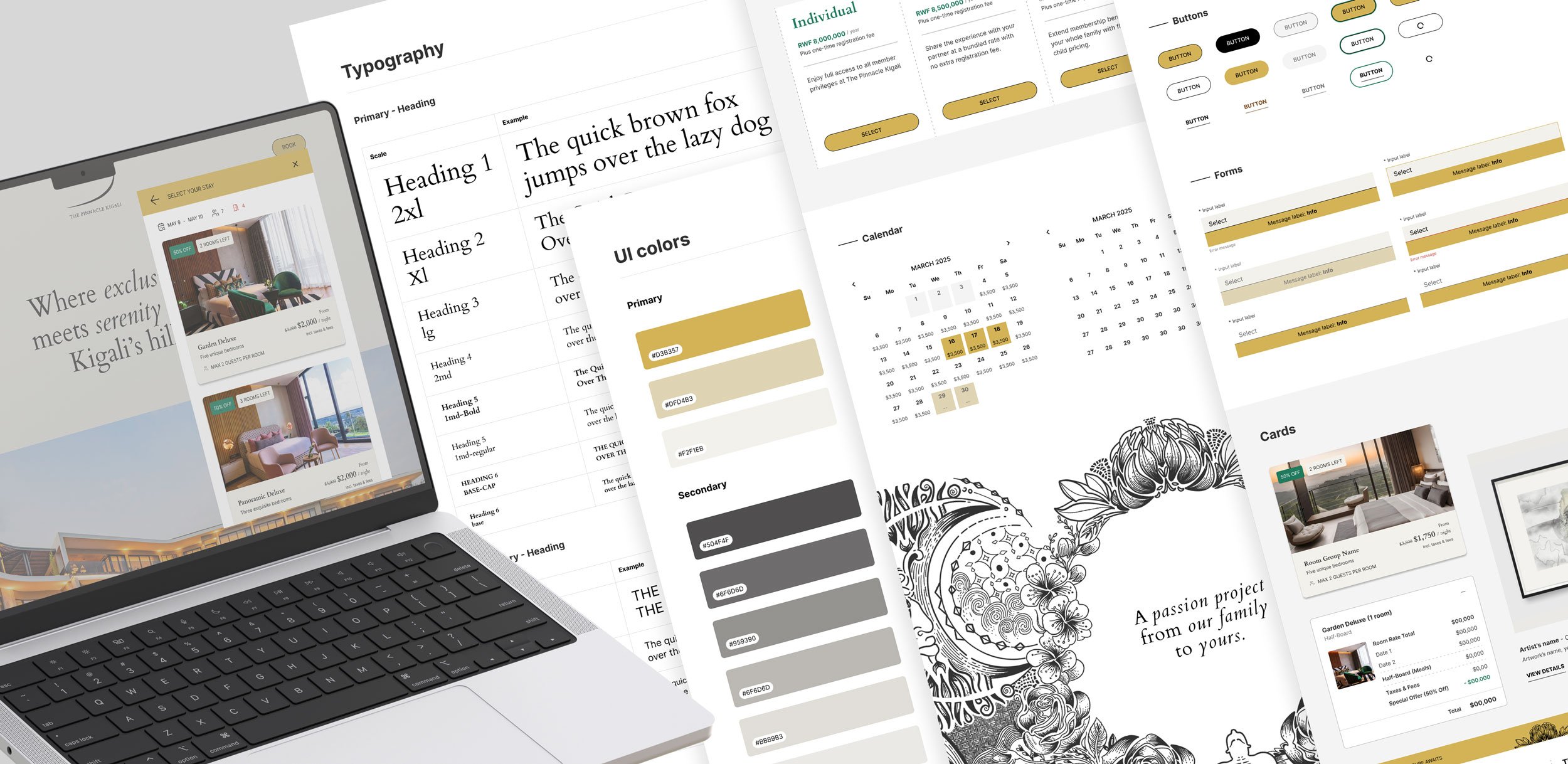
This step didn’t take long, as I had already created a basic style guide while designing the website. This style guide included foundational elements like typography, color, and a small library of early components. Rather than starting from scratch, I revisited what I had, cleaned it up, and reorganized everything into the new design system file.
Set up variables, design tokens, and styles
After diving into how design tokens work, I quickly realized how powerful they are for capturing and managing all the design decisions within a system. However, the toughest part? Naming them.
"Naming tokens—what could be so hard about it?" you might ask. But to my surprise, it turned out to be one of the most difficult parts of the system. After a few failed setups, I found the biggest challenge was figuring out a naming structure that could truly scale. Eventually, I landed on a structure that worked well for us.
1 - Raw variables
I started by creating a collection called Raw, where I stored all my raw values—such as hex codes and numerical values—using neutral, generic names.
For example:
#000000 → color-black
#D3B357 → color-brand-primary

You might wonder, "Why not just use the hex codes directly?"
Giving raw values specific names creates a shared language between designers and developers. Developers often work with design tokens in code (like CSS variables). If they hardcode #D3B357 everywhere and the brand color changes, every instance must be updated manually.
Naming raw values ensures flexibility. Designers and developers can reference color-brand-primary, and any updates made to that value will be reflected everywhere it’s used.
🌟 Tip #1: Don’t use raw variables directly in your design files.
They’re meant to be foundational and have no contextual meaning on their own. Using them directly skips the semantic layer, which makes it harder to understand their purpose.
2 - Semantic Tokens
The next step was establishing the Semantic collection, where I assigned meaning and usage context to each token. Before creating semantic tokens, I asked myself: What are the essential visual elements that most components rely on?
Depending on the complexity of the design system you’re building, the answer will vary. Here’s what worked for me: text, surface, border, and padding.

Examples from my setup:
text/color-primary → references color/base/color-base-black
surface/color-highlight → references color/primary/color-brand-primary
border/color-default → references color/base/color-base-black
This semantic layer made the system easier to use and understand and allowed me to make design decisions based on purpose, not just color values.
🌟 Tip #2: Avoid unnecessary repetition in token names.
For example, in my Semantic > Text folder, I initially named everything with a text- prefix—like text-color-primary, text-color-hover.
But later, I discovered that when exported to code, these tokens appeared as --text-text-color-primary. This redundancy made the tokens harder to manage and cluttered the naming structure.

That small misstep taught me to be more intentional and efficient with my naming conventions and how important it is to think about how tokens appear outside of Figma as well.
3 - Component Tokens
Finally, I created a Components collection, where I stored tokens that apply to specific UI elements in context. For example, in my button/primary folder, I set up tokens like:
button/primary/text-color-disabled → references text/color-disabled
button/primary/border-color-hover → references border/color-default

While components go far beyond just buttons and forms, I intentionally kept this setup focused on what was essential for our current needs. Given the fast-paced environment and differences in working culture, I prioritized simplicity to keep the work moving. The goal was to get the system to a solid enough point to start introducing it to the development team, gather feedback, and refine it together, rather than overcomplicating things too early.
How I built an Atom component using design tokens:

4 - Styles
After establishing my design tokens, I used them to create Typography Styles. By defining font properties as tokens first, I could quickly apply consistent rules across all styles—so if I needed to adjust line height for better readability or tweak heading sizes for responsiveness, I only had to update the token once, and the change would cascade everywhere.

An example of how I set up a Molecule component:

Categorize components
The last step I took before applying the design system to real projects was organizing components into clear, purposeful groups. I used a simplified version of the Atomic Design methodology, categorizing them as Atoms, Molecules, or Organisms based on their complexity and usage.

Atoms are the fundamental building blocks of the interface—simple elements like buttons, badges or tooltips, and foundational styles such as colors, typography, and grids. These elements are indivisible and cannot be broken down any further.
Molecules are slightly more complex components made up of multiple atoms working together. These include elements like input field, input stepper or calendar, where multiple UI elements are grouped to serve a more specific and focused purpose.
Organisms are larger, composite sections of the interface made up of multiple molecules and/or atoms. These are often reusable patterns that define key layouts or functional zones—like a header, hero banner, or card.

To learn more in detail, visit Atomic Design by Brad Frost.
This final step yielded two benefits:
First of all, this made the system easier to navigate. It introduces a clear hierarchy and mental model for both designers and developers.
Secondly, thinking in categories helped me design with relationships in mind. Instead of tweaking a single component in isolation, I began considering how one change could ripple through the entire system. For example, adjusting the padding on a primary button doesn’t just affect that button—it also impacts secondary buttons, modals, and forms that use it.

The Outcome
✅ Quicker response to design requests, with better consistency
With components, tokens, and styles already defined, I could design faster and more consistently, which reduced time spent on repetitive decisions and gave me more time to focus on solving real UX challenges.
✅ Less guesswork in development, fewer QA issues
The system also reduced ambiguity for developers. Instead of second-guessing how a component should behave in different scenarios, they could rely on the documented system, which eliminated about 80% of the questions related to a component's states or functionality. This led to fewer bugs, less QA churn, and smoother handoff.
Below is the overview of the Pinnacle Kigali Design System version 1.0

✅ Design with a stronger mindset of scalability
Another important benefit I experienced with the design system was how it enabled the website to scale without chaos.
As the website evolved to support more features such as multiple-room booking, F&B reservations, and membership conversion, the number of components naturally grew. A lot of the time, due to business constraints and limitations in management, this growth was forced to happen within a short time frame. Without a system in place, I found that this kind of rapid expansion could easily lead to bad setups, messy layouts, and duplicated work.
When designing the Member page, we needed a way to highlight founding members. I reused the existing carousel from the hotel’s room showcase, made a few adjustments, and created a new variant. Paired with another variant of the modal from the Art Collection page, this allowed me to build a storytelling-driven section with minimal effort and consistent design.

This moment confirmed something I strongly believe: investing time upfront to build a solid foundation allows us to move faster, stronger, and more consistently later on. It reduces reactive work and helps me focus on solving real problems instead of reinventing UI every time something new is added.
So, What did I learn?
“Thanks to the new Design System, everything is now perfectly in place, and all problems have been resolved.” That might be true if this were a ‘fictional’ case study. In reality, even though the system has brought real benefits to the design side, as it’s made my work faster and more consistent, aligning with the development team remains a challenge.
At the time of writing, we were still collaborating to ensure the system was implemented as intended and to help the development team optimize their workflow. Time zone gaps, fast release cycles, and a working culture that often prioritizes speed over a complete design process all contribute to the difficulty.
Answering the
Big Question
The design system is not a fixed deliverable, but as something more organic. Like an organism, it evolves alongside the business and its product.
We started with a simple, single-room booking engine and a few static pages for the hotel’s restaurants and services. Since then, we’ve grown into a more complex experience—with multi-room booking, membership conversion, and even a digital art gallery. And the design system grew with it, not just as a component library, but as a map of the past, present, and future.
There’s still plenty of work ahead, but now we’re not building in the dark. We have a foundation. We have a language. And we have a direction.
A Living System
So, if you remember the question at the start, could building a design system be the right strategy to tame the chaos?
Absolutely. It allowed me to establish a clear design process and, step by step, demonstrate the value of an organized and flexible system to both teammates and stakeholders.
However, this is only the beginning. A design system isn’t a silver bullet—it’s just one piece of a much larger puzzle. The next challenge is communication and onboarding, especially with the development team. The true value of a system only comes to life when it’s embraced by everyone, and that takes time, continuous collaboration, education, refinement, and trust.
Want to take a
closer look?
If you're interested in viewing the full design system, feel free to email me for the password.